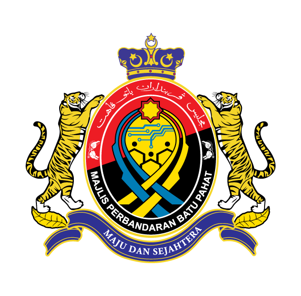
The Batu Pahat Municipal Council (MPBP) logo was created to create a strong and robust identity and reflect the activities carried out in MPBP. The MPBP logo combines several elements namely: lines, abstracts and writing. Each of these elements has its own meaning. It is in line with the vision to be achieved and activities all the time as well as positive values in the organization.
The meaning of each component found in the Logo is as follows:
Reflecting the concern of MPBP and township people in history, and once upon a time this plant was the main plant in the Batu Pahat district.
|
1. |
Crown |
: |
Symbolizing the sovereignty of His Majesty the Sultan and the Batu Pahat Municipal Council under the patronage of the sovereign state. |
|
2. |
Two tigers |
: |
Symbolizing the decisiveness and courage of the Batu Pahat Municipal Council in implementing and enforcing the law. |
|
3. |
Two leaves |
: |
Symbolizing well-being and a healthy and clean environment. |
|
4. |
Jawi text |
: |
The Jawi text 'MAJLIS PERBANDARAN BATU PAHAT' in the position above the logo as a sign that identify, religion and culture are MPBP strengths and they wull always be preserved. |
|
5. |
Rumi text |
: |
The Rumi text 'MAJLIS PERBANDARAN BATU PAHAT' is formed in a curved shape to symbolize MPBP as a leader of progress and preserves the well-being of the people of Batu Pahat Municipal Council. |
|
6. |
Papers |
: |
The slogan 'MAJU DAN SEJAHTERA' at the bottom which is written on a piece of paper (scroll) is a symbol of the official declaration of MPBP as a valid and authoritative municipality. |
|
7. |
Oval shape |
: |
The oval shape becomes the main shape of the Logo. It shows the value of spiritual, physical and mental strength and has high determination and determination. This oval shape is also a symbol of a dynamic Municipal Council that is always ready to face challenges. |
|
8. |
Black pepper |
: |
|
|
9. |
Islamic geometric shapes |
: |
Symbolizing Islam as the official religion and displaying pure values and transparency in administration is MPBP's tenet in carrying out its responsibilities and efforts towards achieving the organization's goals. |
|
10. |
Four blue and yellow stripes |
: |
Symbolizing the movement of the MPBP together with the citizens of the municipality in monitoring the implementation of the development and direction of the MPBP and its administrative area towards a prosperous and harmonious municipality. These lines cross each other to give a symbolic representation of the bond of friendship and neighborhood as well as the unity of the multi-racial community in Batu Pahat. |
|
11. |
Circuit board and current symbols |
: |
Symbolizing MPBP's concern in following the latest technological advances and applying it in MPBP's administration. |
|
12. |
Three arch design |
: |
Represents a strong vision that leads to economic, social and educational progress. While the arch combined with the spherical element symbolizes a community that agrees and respects each other. The position of human symbols stacked on top of each other symbolizes the nature of good neighborliness and mutual cooperation. |
|
13. |
Red and black stripes |
: |
It is the color of the Batu Pahat flag. |
Meaning of Logo Colors
|
Blue |
: |
Symbolizing the values of professionalism in administration and love for the community. |
|
Yellow |
: |
Symbolizing the excellence and glory of MPBP in realizing the ambitions that are always burning. |
|
White |
: |
Symbolizing the honesty, transparency, efficiency and trustworthiness of each individual in carrying out their responsibilities . |


